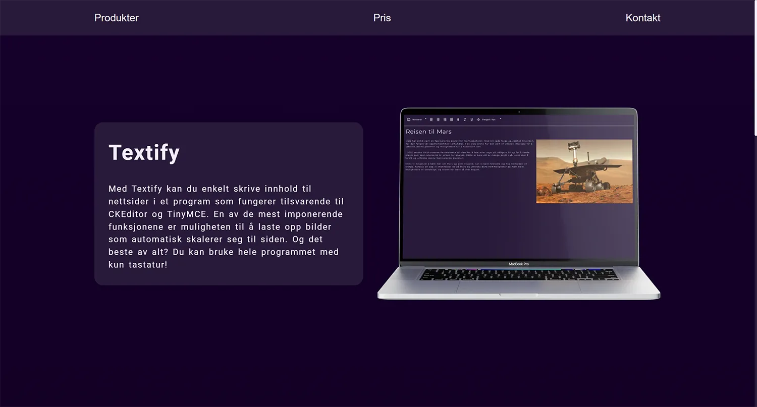
Text app
In this task, I chose to create a rich text editor similar to TinyMCE and CKEditor that would be usable with only a keyboard.
Link to github repository: https://github.com/SyverGiswold/FID2101-1_Tema_8
Link to demo site: https://fid1200-1-tema-8.netlify.app/
Insight
The first thing I started with in the project was to create a very simple test program to see if it was realistic for me to be able to create a text program in the time I was given.
Then I ended up with this program. Very basic functionality, but it still showed me that it was possible for me to create a text program. I also looked at a couple of different videos about creating a text program, like this example. https://www.youtube.com/watch?v=la-0HOaNL10
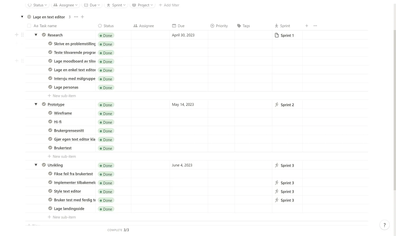
The next thing I chose was to write a list of tasks I had to do to complete the project. I used Notion to organize my tasks. I ended up dividing my tasks into three main categories: Research, prototype, and development. After creating all my goals, I chose to emphasize development the most and at the same time allocate the most time to it. Because I knew it was going to be the most time-consuming part.
Software testing
When I started on research, I chose to start by looking at other text programs to get a better insight into how they work. The programs I tested were Notion, Obsidian, Word, OneNote, TinyMCE, and CKEditor.
What I concluded from these programs was that they all had poor usability for people who use a keyboard, or that certain functions cannot be used without a mouse.
Notion
The program works quite well and is easy to use because line heights and text sizes are set for you, but it is not possible to override these standard sizes. To add elements like lists, bullet points, or headings, you use / commands. Unfortunately, Notion has not taken into account people who cannot see or have impaired vision, because there is no screen reader available in the web version. The screen reader problem is solved in the downloaded version, but it is not possible to switch to many languages in this version so you still do not get a screen reader in Norwegian. Another problem with Notion is that when you use keyboard navigation, there is a poor explanation of what buttons do. So most of the buttons have the same names when you navigate between your pages and Notion does not read the names of the pages. Then it becomes very difficult to find out which file you are opening and I also cannot figure out how to open a file with keyboard navigation.
Good
- It’s easy to use and quick to learn
- Makes it easy to format text
- Can import complex templates
- Very easy to place images
Bad
- Poor/non-functional keyboard navigation
- Non-functional screen reader
- Cannot determine line height and text size
- A lot to navigate through with the keyboard
Obsidian
Obsidian functions partly as a cross between Notion and VSCode. A big advantage I see with Obsidian is that you have the opportunity to edit almost all shortcuts in the program so that it fits you as best as possible. I think the program seems to have better functionality than Notion, but there is more to learn in terms of shortcuts.Obsidian also has a small problem in that I do not see any easy way to create columns or other text formatting that is not to change text size or lists. Images are also a bit difficult to place because I find no easy way to add images that do not take up their own line.Even so, I believe that Notion is a bit better at formatting the text than Obsidian.
Good
- Has many functions
- Can change shortcuts
- Functional screen reader
Bad
- Cannot determine line height and text size
- Lots to navigate through with keyboard
- Complicated program
- It is not very easy to place images that do not cover the entire width of the document
Word
Word is quite good in the form that you have a lot of templates and full possibility to edit your text completely freely. When I tested Word with a screen reader, I found no problems that were insurmountable, but adding images in Word can be quite difficult. It is also almost impossible to adjust image placement with the keyboard alone. This is not just a problem with keyboard navigation. This is just how Word is. As far as I could see, the screen reader worked perfectly, but Word has tons of buttons so it can take a very long time to use keyboard navigation because you have to go past very many buttons.
Good
- Full control over text formatting
- Didn't see any issue with Narrator
- Can navigate the entire app with keyboard
- Can change all keyboard shortcuts
Bad
- Too many buttons
- Extremely difficult to place images
OneNote
OneNote seems to have mostly the same features as Word, but They have been partially simplified which is an advantage so that it does not have to be how many buttons you need to press to navigate with keyboard. The screen reader also seems to work perfectly with OneNote, but image placement is even worse in OneNote than Word. I don't think so is possible to scale down images without using the mouse, but I saw it was possible to add alt text. Unfortunately, I don't know how i can do it with keyboard.OneNote also has a feature that allows you to create text boxes wherever than you want on the whole page and this you actually have the opportunity to do with keyboard only if you want, but there's no saying where you are when you use screen reader.A big problem with OneNote is that you can't navigate between the different notebooks you have or between pages you here in the notepad.
Good
- Good screen reader
- Good/simple text formatting
- Not too many buttons
Bad
- Can't navigate through the entire app with keyboard
- Useless keyboard navigation in web app
- Can't resize images with keyboard
TinyMCE
TinyMCE has pretty good functionality. From as far as I could see, I have no problems with Narrator. It was also very simplified with How many buttons were there and the buttons that existed were grouped under other elements so that you pushed past a group instead of every button. There was also a help button available with all the shortcuts that are convenient. One problem is that the top bar with all the buttons has a tab index of -1 which prevents you from using Shift Tab to get to Buttons. Instead, press Alt + F9. It's a problem if you sitting on a PC with an NVIDEA graphics card because then you have a program with the same shortcut. So then you can't reach the top menu without changing that shortcut.Also, you cannot place images through keyboard alone. You must Drag the image into the file and it is also not possible to place Images made easy with keyboard alone.
Good
- Easy navigation(without nvidea graphics cards)
- Narrator works well
- Few buttons
- Grouped buttons
- Has a help button
Bad
- Can't place pictures with keyboard
- Can't use shift tab to reach top menu
- Unable to determine font size
CKEditor
CKEditor seems to work quite similarly to TinyMCE and then has a lot of the same features. Some of the biggest differences I saw were that CKEditor had several templates for fonts that you could use. This is very convenient. At the same time, I saw it was possible to place images and change The size of the images to fit the text. I didn't find Some possibility get to do it with keyboard, but it's good that you can Place the image easily.A bigger problem with CKEditor was one I didn't figure out how to should be able to navigate their way to the top menu without the use of a mouse.The buttons in the top menu were also less organized than TinyMCE and When navigating between them, I had to select all elements of the button before I got to move on. So first marked I saw the graphic inside the button.
Good
- Easy to place images
- Has some styles for text formatting
- Can place videos
Bad
- Can't use shift tab to reach top menu
- Unable to determine font size
- Don't know how to navigate to the top of the page without a mouse
- Do not know if it is possible to change image size with keyboard
- Lots of buttons and navigate through
Personas
I also had two interviews with people getting to create personas.
- Name: Markus Jensen
- Age: 21 år
- Residence: Luleå, Sverige
- Occupation: Student

Hobbies/Leisure Activities: In addition to Playing video games, Markus likes to exercise and maintain a healthy lifestyle. He prioritizes his physical health and regularly trains for to achieve good overall health and a general sense of well-being. Markus prefer individual fitness activities such as running, cycling or strength training on your own. He likes to set goals and challenge himself even in his workouts, and he finds satisfaction in watching progress and improvements over time. Staying active gives him energy and increases his overall quality of life. Why he might need a rich text editing software: Markus has experience in text editing through his programming background. He prefers simple and user-friendly interfaces. He hasn't previously used text editing software like TinyMCE or CKEditor, but he are open to trying new tools to improve productivity and efficiency in his work.
- Name: Per Olsen
- Age: 54 år
- Residence: Nessoden, Norge
- Occupation: Frontend developer/consultant
Hobbies/Leisure Activities: Per likes to use their free time to maintain their house and perform various tasks related to household chores. He finds joy in seeing the results of his own work as he improves and takes care of his home. He Also likes to read books and listen to music, which gives him relaxation and entertainment. Why he might need rich text editing software: Per has extensive experience with word processors through his work as a frontend developer/consultant. He has used various text editing tools in previous jobs, and he sees the value of having a rich text editing software that can handle flexible text and features such as image insertion and Tables. Per-stock applications where the text content needs to be more dynamic and adaptable, and he wants to have a tool that can handle these needs in a simple way. He also sees the need for alternative text to images to ensure good accessibility for users.
Prototyping
Low-fi
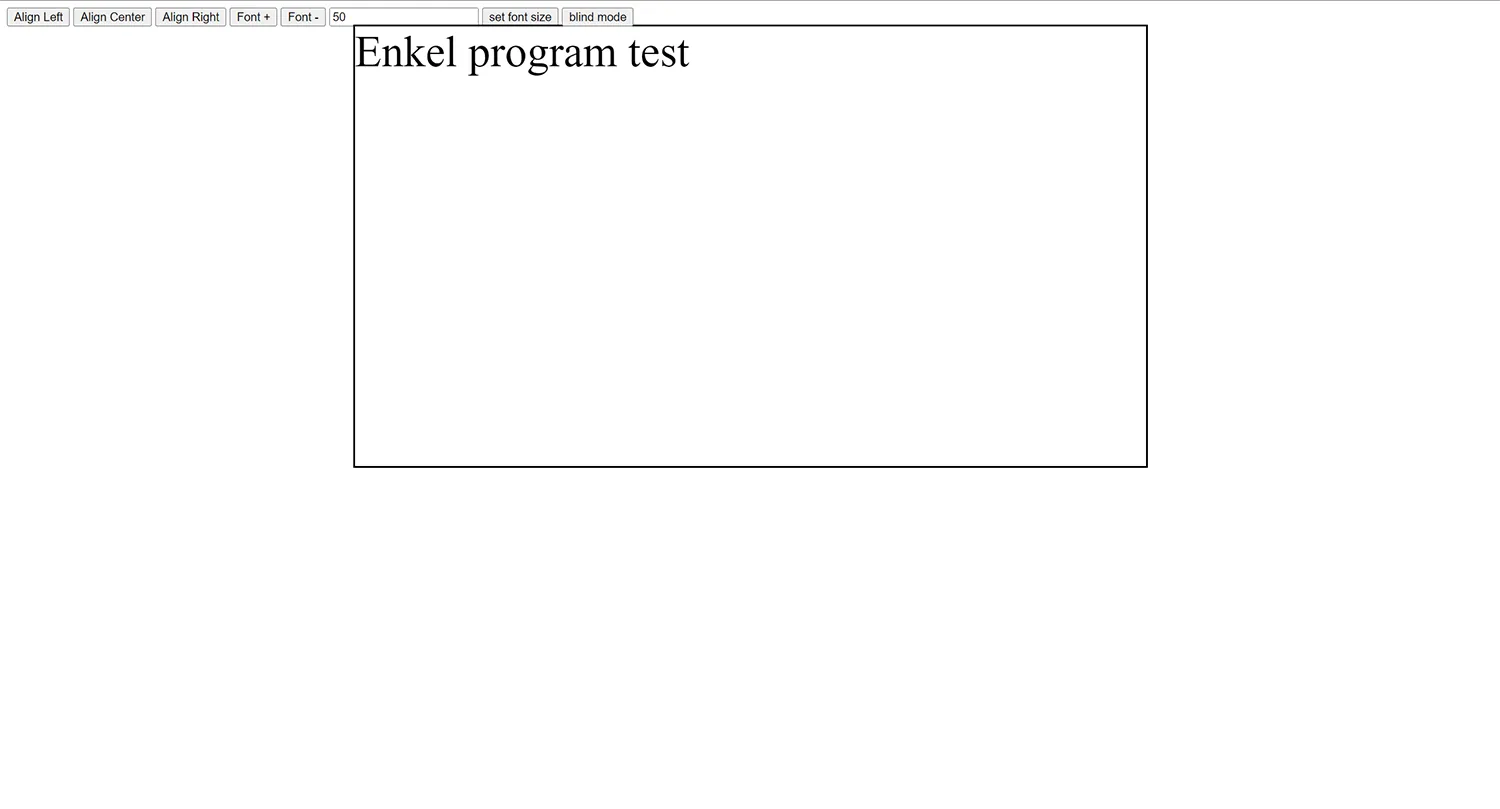
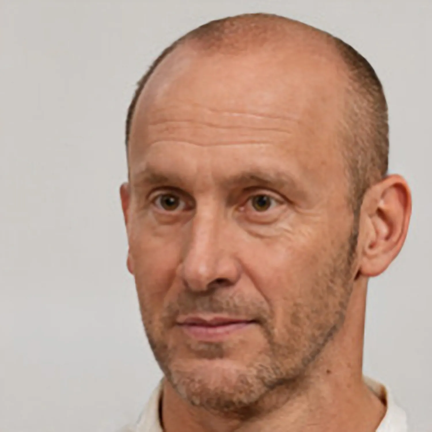
When I finished researching, I started with a wireframe so that I be able to start finding icons and test out where the buttons should be placed since I was going to use tab to keyboard navigation. The next step for me was to do the simple text program. This was a process I spent over 2 weeks on because this was far more complicated coding than I could. So much of Javascript is either taken from the web or I have written it with the help of ChatGPT. I just started by entering the most basic ones features such as. To set text right, left and centered. So I also included the option to change text size.
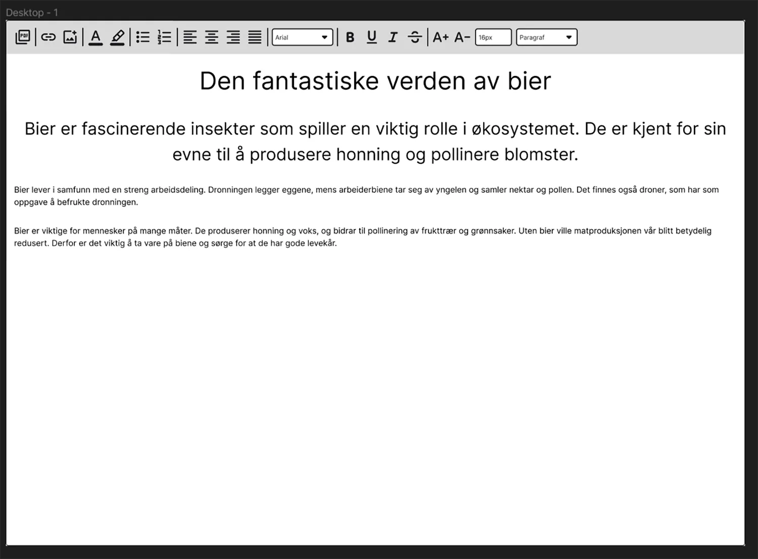
When I user-tested this version, the user should write the same one The text that is in the image above and format the text equally. One of the My user tests were done with a person who couldn't see the screen. This was done with a button that made the entire screen black but could Use only screen reader and keyboards. The other two could see, but had to still use the keyboard. I didn't get very many concretes feedback from the user test, but I got some input and The users found a couple of errors that I wouldn't have found myself without others had tested the program. One important thing I noticed when people tested was that no one chose to set their own text size. Everyone would rather Use the predefined sizes. So then I removed the option of to set my own sizes even though I originally wanted it because it provides A little more freedom to the user.
Feedback
- Confusing that you have to type first then you can make changes.
- Needs confirmation that buttons are being pressed.
- FontSize element functions poorly with screen reader.
- The predefined h and p tags do not work.
- add the ability to highlight words.
- The image button and link button both look like adding files.
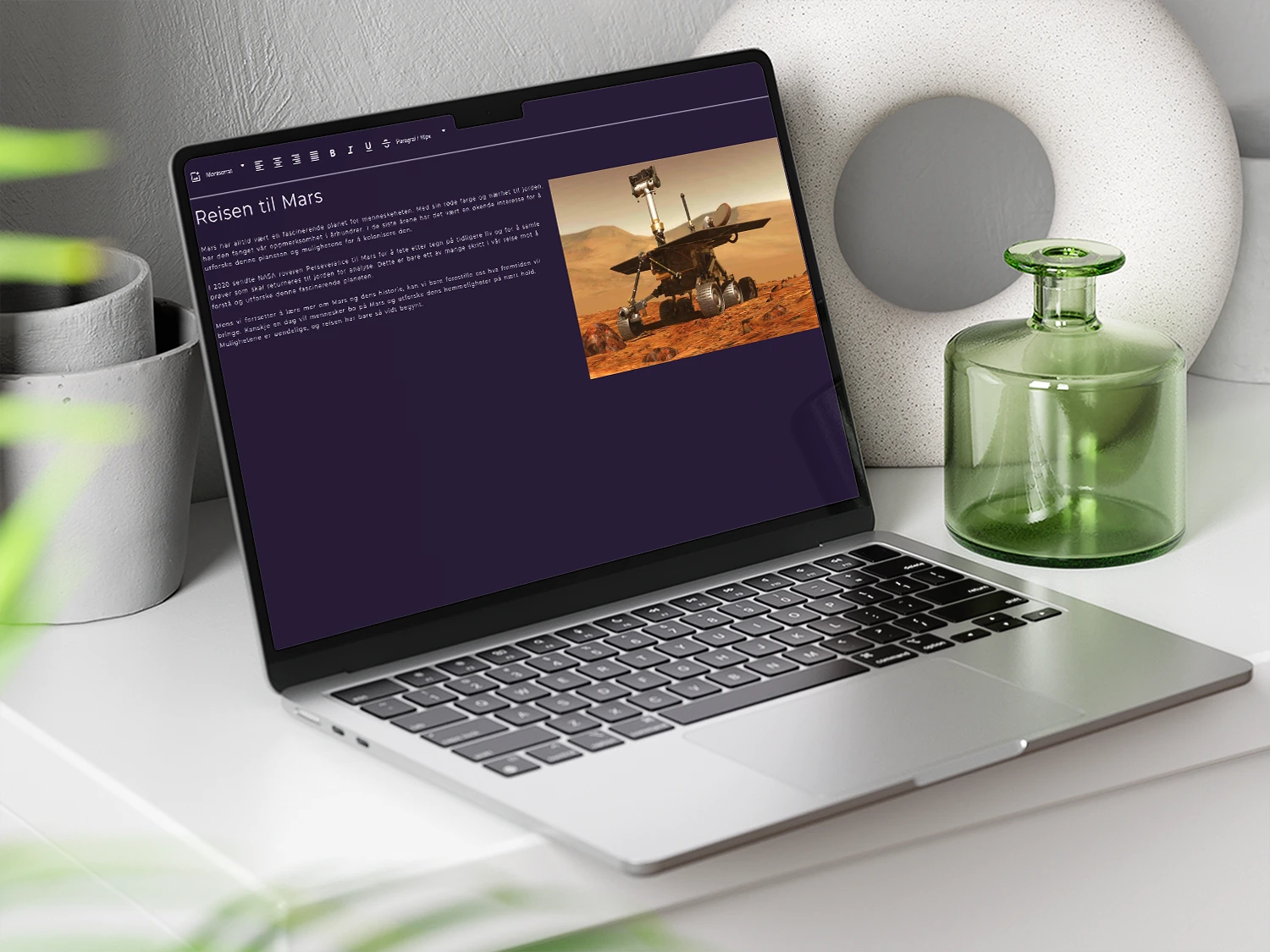
Hi-fi
When I had finished the user tests and had fixed the biggest ones The problems I started by setting up a text landing page Program. I had a pretty concrete idea of how I wanted that The website should look like. Then I made a couple of lit different variations in Figma. Here's also a video I took inspiration from https://www.youtube.com/watch?v=T33NN_pPeNI&t=1s
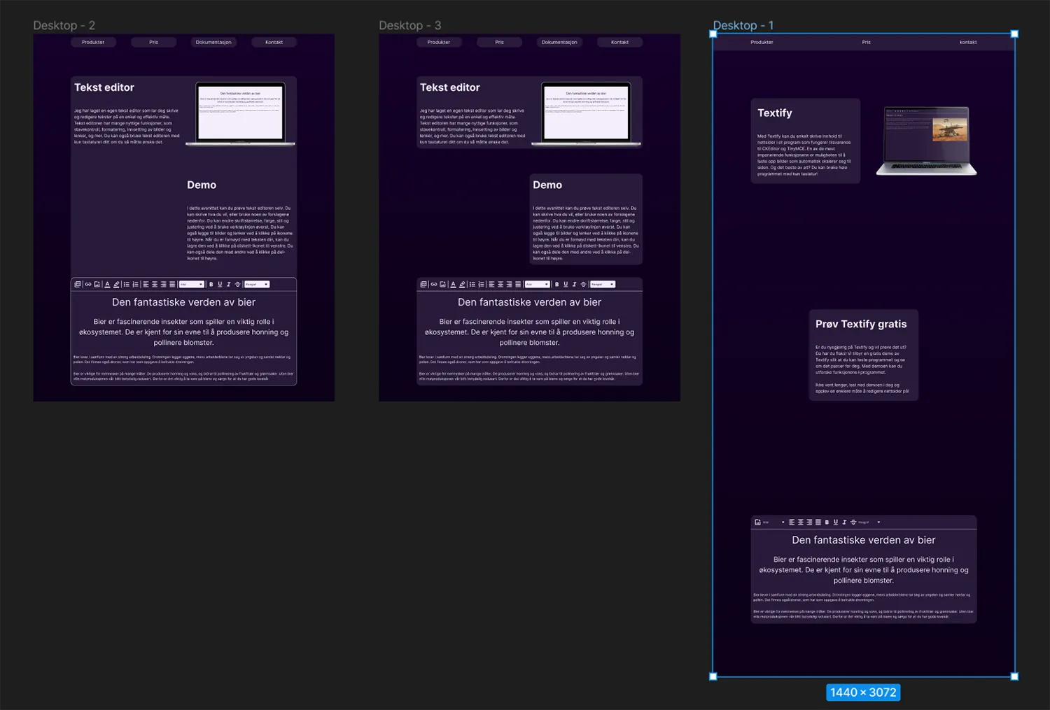
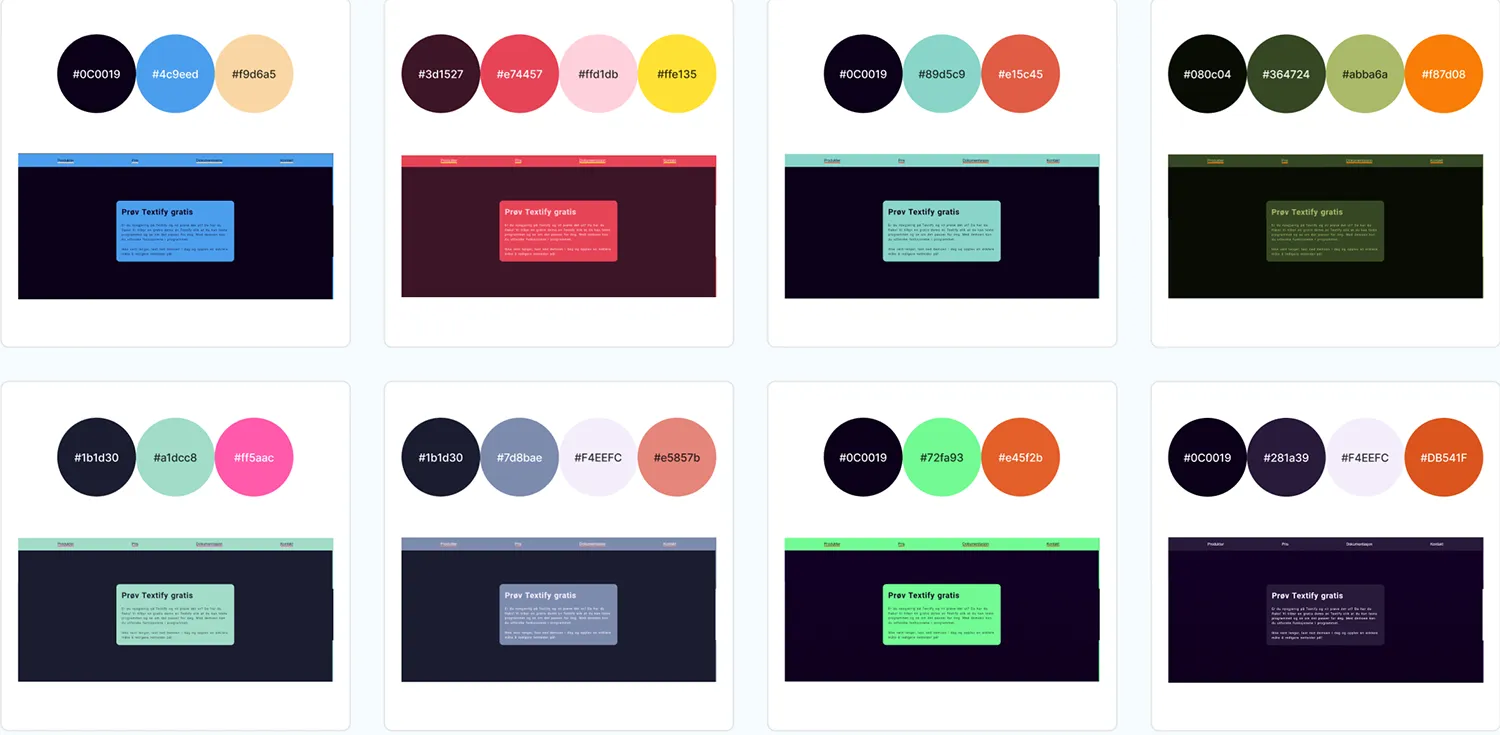
When it came to color, I'd gotten feedback that someone would rather that the website should be dark so then I chose to look at some dark colors Palettes. I chose to use the last color palette.
When it came to creating the landing page there weren't many problems I support on. This only thing I had problem with was the animation on website. It was because the wrong element had a class of animation.
When I finished the website I worked on trying and doing text program better, but when I worked with it I noticed that I had been over ambitious when I had set up features I should create. I ended up cutting out half of those. The most Complicated feature that was left behind was adding images.